
17.css3 スマホ&タブレットに対応 メディアクエリ Mwdia Query Chap 6
学習書の「sample_a」(Chap6)を表示しソースコードを見て下さい。
スマホ&タブレット対応
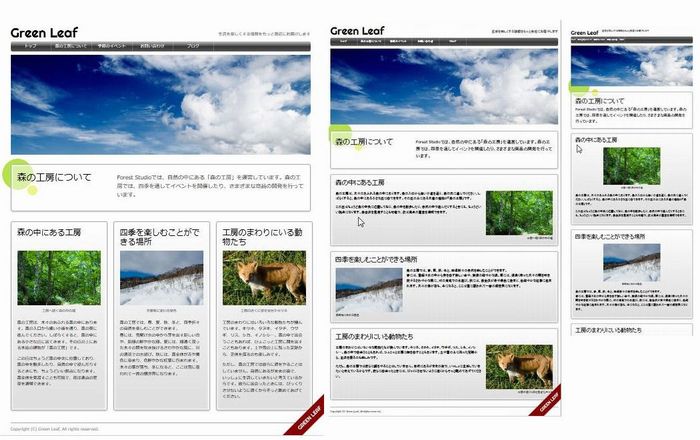
学習書で作成しているサイトの設計は横幅900pxで、HPをPCで表示する場合、同サイズが一般的である。このHPをスマホでやタブレットで表示すると下図のように極めて小さく画面に横900pxで表示される。スマホなど小さな画面にも関わらず、高解像度で表示出来てしまう(iOS & Android3x/4xで980px)。その結果、下図右端のように小さな画面に900pxのHP全体が表示出来るが、これでは文字が小さすぎて、とてもではないが文字が読めない。
対応前
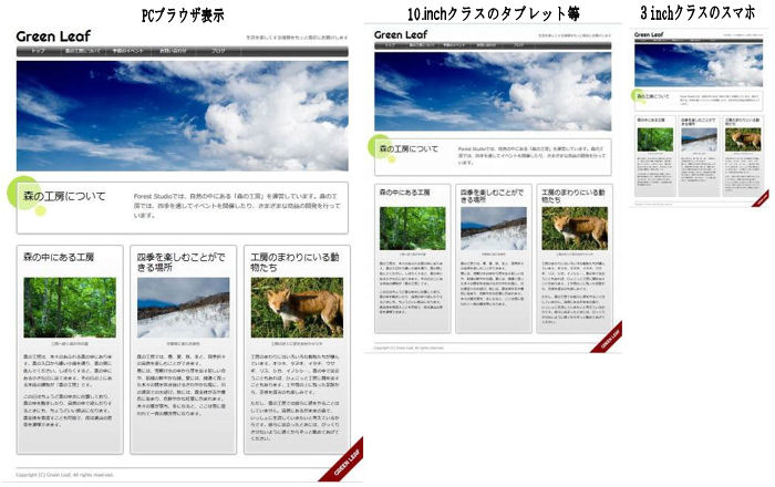
↓
対応後(CSS Media Queries(メディアクエリ)の利用)
Media Queriesを利用して使用端末のdencityに基づく解像度を取得し、端末サイズに合わせた表示をCSSで指定する方法。詳しくは学習書で。
・画面が900px以上の場合→3段組、600px以上899以下→下図中央の表示、599px以下→下図右端の表示
CSSの記述
|
1 2 3 4 5 6 7 8 9 10 11 12 13 14 15 16 17 18 19 20 21 22 23 24 25 26 27 28 29 30 31 32 33 34 35 36 37 38 39 40 41 42 43 44 45 46 47 48 49 50 51 52 53 54 55 56 57 58 59 60 61 62 63 64 65 66 67 68 69 70 71 72 73 74 75 76 77 78 79 80 81 82 83 84 85 86 87 88 89 90 91 92 93 94 95 96 97 98 |
/* ====== PC用の設定 ====== */ @media only screen and (min-width:900px) { /* 3段組み */ article div[itemprop="articleBody"] {display: -webkit-box; display: -moz-box; display: -ms-box} article section {width: 288px; margin-right: 18px; box-sizing: border-box; -webkit-box-sizing: border-box; -moz-box-sizing: border-box; overflow: visible} article section h1 {height: 48px; line-height: 1.2} article section:nth-of-type(1n) figure {float: none; margin: 0} article section:nth-of-type(1n) figcaption {text-align: center; margin-bottom: 15px} /* 3段組み IE8~9 & Opera */ article section {clear: none; float: left; position: relative} article section + section + section {margin-right: 0} } /* ====== タブレット用の設定 ====== */ @media only screen and (min-width: 600px) and (max-width:899px) { div#container {width: 100%; box-sizing: border-box; -webkit-box-sizing: border-box; -moz-box-sizing: border-box; padding: 0 10px; background-position: -3px 380px, 100px 460px} header#pageheader img {width: 100%; height: auto} nav ul {font-size: 10px} nav ul li a {width: 100px} } /* ====== スマートフォン用の設定 ====== */ @media only screen and (max-width:599px) { div#container {width: 100%; box-sizing: border-box; -webkit-box-sizing: border-box; -moz-box-sizing: border-box; padding: 0 10px; background-position: -3px 220px, 100px 280px} header#pageheader img {width: 100%; height: auto} nav ul {font-size: 8px} nav ul li a {width: auto; display: inline-block; padding: 0 3px} header#pageheader h1 {font-size: 24px; margin-right: 15px} header#pageheader h2 {font-size: 10px; text-align: left; padding: 0} article header h1 {float: none} article header p {margin: 0} article section:nth-of-type(1n) figure {float: none; margin: 0; text-align: center; display: block} article section:nth-of-type(1n) figcaption {text-align: center; margin-bottom: 15px} } |
- 行番
- 説 明
- 4-33
- 3段組み部分を2行目と35行目で囲む
- 38-
- タブレット及びスマホの表示設定