
15.css3 高さを揃えた3段組レイアウト 同じサイズのボックスが横3列に並ぶ Chap 5-12
学習書の「sample_a」(Chap5_1-12)を表示しソースコードを見て下さい。
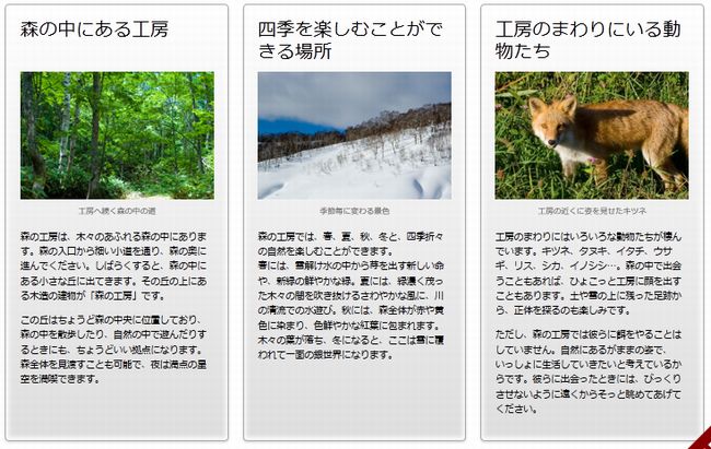
3段組レイアウト
コンテンツの3つの「article section」をボックス化して3段組みとしている→CSS3のフレキシブルボックスレイアウトと言う。
3段組みのCSS記述
|
1 2 3 4 5 6 7 8 9 10 11 12 13 14 15 16 17 18 19 20 21 22 23 24 25 |
/* 3段組み */ article div[itemprop="articleBody"] {display: -webkit-box; display: -moz-box; display: -ms-box;} article section {width: 288px; margin-right: 18px; box-sizing: border-box; -moz-box-sizing: border-box; -webkit-box-sizing: border-box; overflow: visible;} article section h1 {height: 48px; line-height: 1.2;} article section:nth-of-type(1n) figure {float: none; margin: 0;} article section:nth-of-type(1n) figcaption {text-align: center; margin-bottom: 15px;} /* 3段組み IE8 - 9 & Opera */ article section {clear: none; float: left; postion: relative;} article section + section + section {margin-right: 0} |
- 行番
- 説 明
- 2-3
- 3つのセクションをボックスにまとめる
- 3-4
- FireFoxとIE対応
- 6-11
- ページ幅900pxに3つのセクションを入れる
- 12-13
- 3つのセクションヘッダーの高さや行間
- 14-16
- 3つのセクションの中の画像レイアウト調整
- 17-19
- 3つのセクションの中の画像キャプションを調整
Internet Explorer7 対応のCSS記述
|
1 2 3 4 5 |
<!--[if lt IE 8]> <style> article section {width: 250px} article section figure {margin-left:0} </style> |